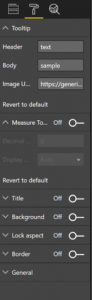
 Tooltip Section:
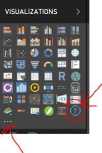
I know this is a very basic and simple visual, but if you struggle with fitting everything into a report, this is just one more option for you. Below is the link to the visual in the App store. https://appsource.microsoft.com/en-us/product/power-bi-visuals/WA104380983?tab=Overview Thanks for reading! And for those who celebrate, Happy Thanksgiving!

- WHO WE ARE
-
-
IT CONSULTANT & MANAGED SERVICE PROVIDER
At Netrix Global, we are passionate about solving problems through technology. Whether you need our experts to consult on how best to leverage your existing resources, extend the capabilities of your team to complete a specific project, or manage your environment 24x7, we can step in whenever and however you need us to. Our Approach
-
AN EXTENSION OF YOUR TEAM
Netrix Global is a team of some of the most accomplished engineers, solution architects, and service professionals in the industry. We believe we are an extension of your business, so it's important that you know who you'll be working with. See who makes up our team of experts. MEET OUR EXPERTS
-
-
- EXPERTISE
-
- SERVICES
-
-
ADVISE. DEPLOY. RUN
Our approach to delivering results focuses on a three-phase process that includes designing, implementing, and managing each solution. We'll work with you to integrate our teams so that where your team stops, our team begins.
OUR APPROACH
-
PROFESSIONAL SERVICES
Design modern IT architectures and implement market-leading technologies with a team of IT professionals and project managers that cross various areas of expertise and that can engage directly with your team under various models.
OUR PROJECTS
-
MANAGED SERVICES
With our round-the-clock Service Desk, state-of-the-art Technical Operations Center (TOC), vigilant Security Operations Center (SOC), and highly skilled Advanced Systems Management team, we are dedicated to providing comprehensive support to keep your operations running smoothly and securely at all times.
OUR SERVICES
-
-
- KNOWLEDGE BASE
- RESOURCES

